
I could, however, at least take a screen shot, so that's what I have for now to post. Hopefully, I'll get more learned in some graphic design software.
I did, however, figure out how to make my very own Leon logo (sort of) from a photograph of the pig that inspired the beer.
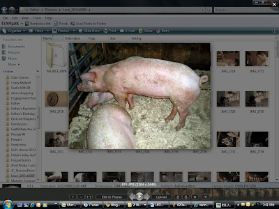
Open up photoshop (I have the 'elements' version, which is the stripped down from the pro version) and bring up picture of a pig:
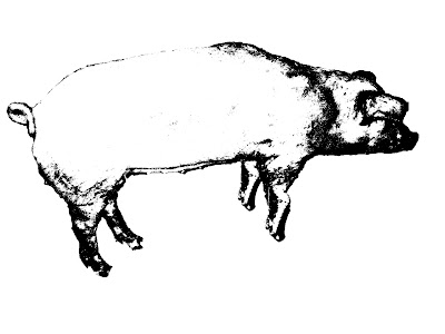
First, use the 'quick selection' tool, to select all the areas around the subject, in this case, the handsome Leon. Delete these sections as you go. You can see that Leon's front foreleg is cut off by his tasty, albeit lazier roomate. No problem, use the quick selection tool on the other hamhock, copy and paste it, increase the size a bit to make it appropriate scale. Now that you've knocked out the noisy background, and added back the leg, reduce color saturation to zero, to make a black and white image. Increase contrast to 100%, then posterize until you have only two colors...black and white. I tried using the sumi-e brush effects tool, but I liked what I got from the aforementioned manipulations to not need that extra step.
Flip him around 180 degrees, and this is what you end up with.
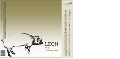
Using various text boxes, a UPC code image I downloaded from the 'net, fonts downloaded from dafont.com, I whipped this up in about 2 hours. Alot of that was learning curve on the photoshop plus sifting through fonts, though.
What do you think? First, I tried to get the label image to appear bigger than below, but just the perfect storm of the limitations of Word, MS Paint, and Blogger software, I guess. Anyhow, the label layout is too small for a 22oz bottle (its only 4x5inches), so I'll need to redo it on a larger Word template, and that's OK. I just wanted to get the concept down. Feels like its missing some sort of background, maybe a wide-wooden slat type of wooden barn feel, or something, but I really like where this one is going.


Yes, I like where this is going too!
ReplyDeleteI may be able to help, have nifty graphic design software we could try. Let me know!
But impressed that Word got you this far! Nice!